A reflection on "Appearances do matter!" in C&RL News by Nancy Fawley
A new issue of College & Research Libraries News arrived in my mailbox sometime late last week. Typically, this publication is one that's more a browser than a reader for me. The articles tend to be fairly short and you can get a lot out of just skimming them. This time, however, I stopped to read Nancy Fawley's article "Appearances do matter! What libraries can learn from Clinton Kelly."
Let me first say, I used to be a "What Not to Wear" addict. I had cable while in graduate school and it was the perfect guilty pleasure. I've learned a lot from Stacy and Clinton over the years and I think I'm definitely more stylish for having watched the show. When I saw Clinton was the closing keynote for ACRL last year, I was geeked.
Clinton's talk was fun, to say the least, and was insightful in discussing the way we present ourselves, not just in our fashion choices, but in the way we treat people, too. In seeing Fawley's article about Clinton, I was curious to read her opinions on how Clinton's advice applies to libraries.
While the article is not in depth by any means, it gives some great pointers as to why we, as librarians, should care about things like design, branding, and the visual appeal of the building. If I were you and hadn't read the article, I'd go check it out right now.
Nothing Fawley said was new to me. I've been passionate about the way that libraries represent themselves to the people they serve for a long while. What was refreshing, however, was the fact that this is what I'm hoping to help accomplish here at GVSU in the coming year. In less than a year, we will be moving into a new building that is on the cutting edge of library design. I'm excited for the opportunities we'll have to reach out to the campus in new ways.
This also means we have a unique opportunity to rebrand ourselves-to recreate our image. We've already started creating the approachable image through our @gvsuMaryI Twitter account.
There are many conversations that still need to occur and many decisions that need to be made before we're ready to move into the new library and a new chapter of the University Libraries as an organization at Grand Valley. I think it will be an exciting process and am glad to know that others, like Fawley, agree that appearance is important even in the library.
No matter how many times we may say not to judge a book by its cover, we all know that we do and there's no stopping it.

Showing posts with label design. Show all posts
Showing posts with label design. Show all posts
Wednesday, August 8, 2012

Tuesday, April 24, 2012
What your font says about you: League Gothic and Cooper Black
First off, let me say that I know not everyone has an eye for design. I know not everyone thinks about fonts, dreaming about x-heights and ligatures. I do, however, think that people should have at least some sense of what makes for a good font choice.


Case in point: each morning as I walk into work, I see a sign that I designed for the current "Exam Cram" event at the library, during which the library is open for 24 hours to give students a place to study through the night.

A simplified architect's lamp paired with League Gothic makes for a distinct look. League Gothic has weight, but also a bit of sophistication to give it a more authoritative feel. This look, even with the colors, says, "Time to get down to business."
Enter the other sign with the specific hours listed. In Cooper Black.
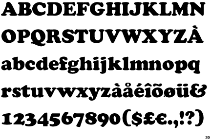
While this has a heaviness to it somewhat similar to League Gothic, the contrast of thick and thin along with the playful roundness of the serifs give it a more playful, cartoonish feel. If you don't believe me, then take a gander at where Cooper Black has been used in the commercial world:


The playful feel of Cooper Black is perfect for Garfield the Cat, especially when you consider it's heftiness. As far as easyJet goes, they're going for that playful feel, while also asserting their presence using the weight. Used with the emotion of the font in mind, Cooper Black can be effective. If I were designing a cartoon book for kids or the box for a game, I might use Cooper Black. I might even use it if I were working in a public library for an event for kids or in the juvenile section. In the university library, however, not so much. Cooper Black says something to the public about us as an institution that doesn't reflect who we believe we are.
As we look forward to a new building, we're also trying to build our brand. I'm doing a bit of research on this, thinking about what type of emotion we as an organization want to put out into the campus and the public at large. Is the authority of League Gothic the way to go for everything here on out? Or do we need something with more open space, something not so condensed.
Friday, July 2, 2010
In case you haven't heard...
... I got the job at Grand Valley! I will be the Liaison Librarian for Nursing. Steve and I will be living and working downtown Grand Rapids. I'm so excited! We're moving in just under two weeks.
I've had some time to do some fun stuff, so I've got some things to show! First off, is Steve's website. It was a challenge to build a site for someone on the pickier side, but it was good to stretch myself and learn new things. Check it out at wellington-photography.com. And if you're in Michigan (especially West Michigan) and need some pictures, let us know! We've been having a blast doing photography together.
I've also been doing some fun design work. I wanted to get a calendar for my office, but everything 2010 is gone or is ridiculous (think puppies hiding in flower baskets). So I designed some calendar pages for the rest of the year myself! They've got kind of a retro feel to them - I like it!


I've had some time to do some fun stuff, so I've got some things to show! First off, is Steve's website. It was a challenge to build a site for someone on the pickier side, but it was good to stretch myself and learn new things. Check it out at wellington-photography.com. And if you're in Michigan (especially West Michigan) and need some pictures, let us know! We've been having a blast doing photography together.
I've also been doing some fun design work. I wanted to get a calendar for my office, but everything 2010 is gone or is ridiculous (think puppies hiding in flower baskets). So I designed some calendar pages for the rest of the year myself! They've got kind of a retro feel to them - I like it!


In other news... I've been knitting a lot, too! Tons of craftiness at the Bedford household!
Tuesday, November 17, 2009
Here it is!
So, I'm going to try to post on here rather regularly about what I'm up to in library world. I'm also going to try to post some of my photography and design work. Should be fun!
Right now, I'm working through some cataloging and have just finished writing a first draft of a critical bibliography of Edward Elgar's Enigma Variations. I've also been working on a bunch of design stuff - check it out on Scribd!
Right now, I'm working through some cataloging and have just finished writing a first draft of a critical bibliography of Edward Elgar's Enigma Variations. I've also been working on a bunch of design stuff - check it out on Scribd!
Subscribe to:
Posts (Atom)